Project Overview
-
Date / Duration: 2 weeks, January 2024
-
My Role: UX Designer
-
Deliverables: Mid-Fidelity Figma Prototype
-
Target Audience: Individuals that enjoy reading / consuming books
-
Highlighted Work: Heuristic analysis, competitive analysis, usability testing, open & closed card sort, site map, sketches, wireframes & mid-fidelity prototype
Our Client
Design Challenge
The Library
Site Redesign
The Hewlett Woodmere Public Library has been a token within the local community for the past 75 years. It has a wide range of offerings, traditional book rentals included, and it provides a space for collaboration and community.
Design an e-commerce site that implements information architecture, web layout and UI best practices to provide an intuitive, conventional and findable shopping experience.
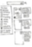
01
In the Research section, we walk through our heuristic analysis, competitive analysis, and outputs from our open / closed card sorts.
02
This section contains a walk through of our ideation process: including where we got inspiration for our site redesign for our 3 key pages (the landing page, product listing page, and product information page).
03
This section shows the early iterations / initial layout of our solution; including the landing page, the product listing page and the product information page.
04
Within this section is the evolution of our design as we increased the fidelity of our wireframes for the library site: it also includes videos of our final mid-fidelity prototype and our Figma link.
Research
Heuristic Analysis
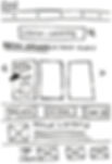
We based our heuristic analysis on Jacob Nielsen's 10 Usability Heuristics of User Interface Design. The first category of problems we found in the site were in the aesthetic and minimalist design heuristic. This principle indicates that there shouldn't be any unnecessary information or data cluttering a site. With the landing page below, we see an overcrowded landing page where a user's eye is drawn in a ton of different places.
The next problem we saw can be categorized into Nielsen’s error prevention heuristic. This heuristic emphasizes a designer’s responsibility to minimize the likelihood of user error. In the image below, the navigation bar is filled with unclear titles; two examples of this are “borrowing” and “children & teens.” This unclear titling makes it difficult for a newer user to seamlessly navigate through the site and, therefore, increases the likelihood of user error.

The third problem we saw can be categorized into Nielsen’s consistency of standards heuristic. This heuristic identifies that users experience through a site or mobile application should be uniform and predictable. In the image below, we see a site page that is inconsistent with the design of the HWPL site seen in the video above. This difference in interface can confuse and diminish the overall user experience.

See the full heuristic analysis below:


Research
Competitive Analysis / Feature Inventory
We benchmarked the HWPL site against another local library, Lynbrook Public Library, and two other well-known libraries; the Brooklyn Public Library and New York Public Library. From our analysis, we recognized that the HWPL site had a lot of the same features and functionality of the competing libraries, as seen in image below, but lacked a design that supported easy navigation and usability.

Research
Usability Testing, Task Analysis & Persona
To ensure our assessment of the site was complete and accurate, we conducted usability testing with 5 different users (see results below).
This testing revealed that users struggled most with the primary task of finding and reading books. More specifically, the figure below shows that 0% of individuals were able to find instructions on how to rent a book and 70% of individuals borrowed an e-book via a path that was not the intended path. In other words, if individuals cannot easily find instructions on how to rent a book, they are less likely to actually leverage the site for renting a book.


In order to better understand the users, we decided to zoom in on one user experience and develop a task analysis and user journey. From the chart below, it became clear that there was a significant negative reaction from users when they were looking for best sellers, which was located at the very bottom of the landing page, and also when they were picking a book and couldn't easily find more information on that book.


We leveraged all of the information that we gathered through our research synthesis process and created our persona, Megan. Learn more about Megan below:

Research
Open / Closed Card Sort
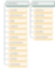
To understand how to enhance the information architecture within the library's site, we conducted a series of open and closed card sorts. During our open card sort, we put a list of 35 site pages in front of 15 users and asked them to organize them into groups. From the 15 respondents, we got 15 unique results and minimal insight into the optimal site navigation structure.
With this in mind, we followed the open card sort quickly with a closed card sort. We took inspiration from other library sites when putting together the categories to group the page sites into. We then put the a modified list of 34 page sites, and 9 categories in front of users. After conducting the closed card sort, we got compelling results that indicated to us that we needed to be intentional with the naming conventions of the category titles.
The Biggest Changes:
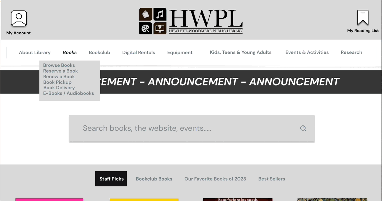
The biggest changes we made were to the "About" section, now the"About Library" section, and the "Borrowing" section, now the "Books" section. Within the "About Library" section we incorporated any categories related to the maintenance and administration of the library. Our card sorting exercise showed us that word association is strong with end-users so, adjusting the naming convention from "About" to the "About Library" section made it much clearer to users what belonged there. Similarly, anything book-related was bucketed more clearly into the "Books" section and any other things that you could borrow from the library that were initially in the "Borrowing" section were put into their own "Equipment" or "Digital Rentals" categories.
Before
After:
Ideation
Sketches
For ideation, we drew inspiration from successful websites like the Brooklyn Public Library and Goodreads.
The new HWPL home page was largely inspired by the successful design of the Brooklyn Public Library’s website. The clear search functionality and carousel of book recommendations was pulled directly into our design for the HWPL home page.
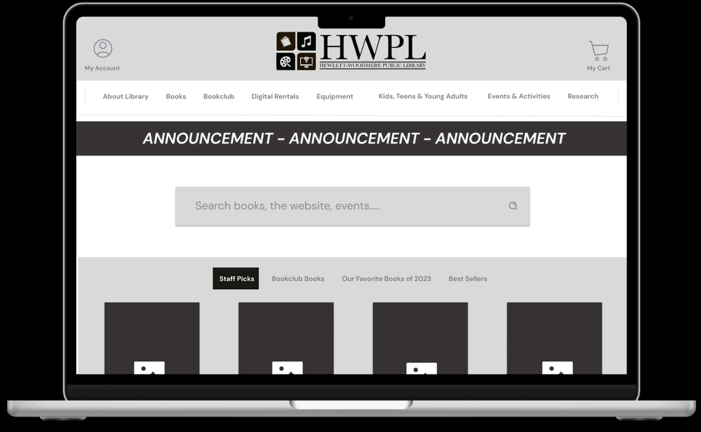
Landing Page

Search Bar
Best Sellers
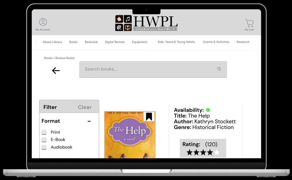
Product Listing Page
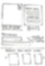
For our product listing page, we included a filtered search function and the ability to like or save books. Each of these things were once again inspired by the design of the Brooklyn Public Library’s website: as seen below.

Filter Search
Save Feature
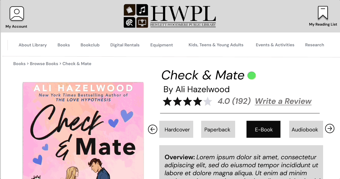
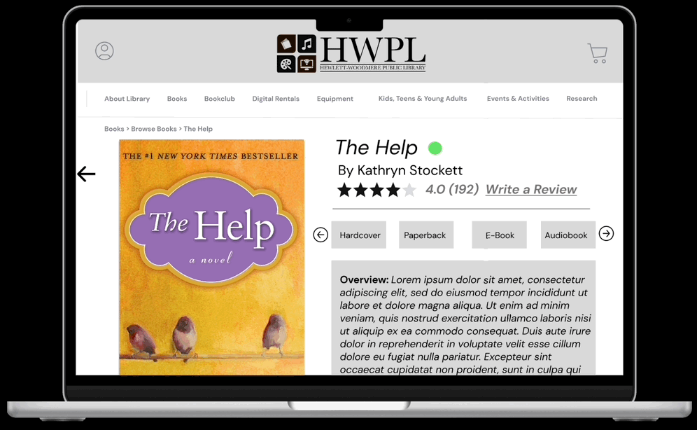
Product Information Page
For the product information page, we pulled inspiration from Goodreads. The review and rating functionality and book recommendation feature within the site was something we chose to incorporate into the HWPL site redesign as seen in the images below.

Book Recs
Book Reviews
Wireframes
Layout of Site Pages
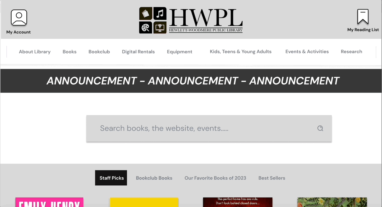
Below is the revised homepage, product listing page and product information pages. These wireframes reflect a focus on minimalistic design, efficient search / filtering, and a balance between images and text.
Prototype
Final Mid-Fidelity Prototype
When configuring the final mid-fidelity prototype, we thought specifically through a scenario where an individual was searching for a specific book to read. We wanted to make sure this individual could easily search for this book, rate this book and save other books to their reading list that they saw along the way. The following videos show insight into how these things were captured in the final mid-fidelity prototype.